CSS Grid
Read at your own pace. Code execution, quizzes, progress tracking, and the AI tutor are available in the interactive view with JavaScript enabled.
Grid Orientation
From flexible rows to deliberate surfaces
In CSS Flexbox, you learned the one-dimensional contract: distribute items along a main axis, then align across the cross axis.
CSS Grid is the next layout tool because many real product surfaces are not just rows or columns. Dashboards, media galleries, game inventory screens, article pages, and admin consoles all need a two-dimensional plan.
Think of Grid as the puzzle board. Flexbox is great for arranging pieces in a line; Grid defines the board itself.
By the end, you should be able to explain:
- when Grid is the right primitive
- how tracks, lines, cells, and areas relate
- how explicit placement differs from auto-placement
- how to debug Grid without randomly changing CSS until it works
Next lesson, Responsive Web Design, will build on this by adapting these grids to different viewport sizes.

The Grid Contract
Grid separates the plan from the content
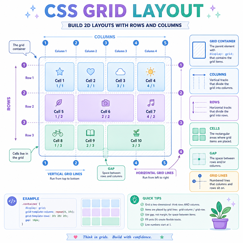
A grid container creates a coordinate system for its direct children.
.container
┌──────────┬───────────────┬──────────┐
│ sidebar  │    main       │  aside   │
├──────────┼───────────────┼──────────┤
│ footer   │    footer     │ footer   │
└──────────┴───────────────┴──────────┘
The useful mental model:
-
Container: the element with
display: grid - Items: direct children of that container
- Tracks: rows and columns
- Cells: intersections of a row and column
- Lines: numbered boundaries around tracks
- Gaps: spacing between tracks, not margins on children
This is a staff-level distinction: Grid lets layout intent live on the parent. Children can still opt into placement, but the overall page structure is not hidden inside many unrelated item widths.
Lines And Spans
Grid lines are coordinates
If a grid has 3 columns, it has 4 vertical grid lines. Items can start and end on those lines.
That means placement usually reads like:
- start at line
1 - end at line
3 - therefore span columns 1 and 2
Negative lines count from the far edge. For example, -1 means the last line.
Here is a tiny JavaScript model that prints what those coordinates mean. The CSS idea is grid-column: start / end; the JS is just making the line math visible.
```js
const columnTracks = ["sidebar", "content", "aside"];
const lineCount = columnTracks.length + 1;

function normalizeLine(line) {
  return line < 0 ? lineCount + 1 + line : line;
}

function describePlacement(name, start, end) {
  const normalizedStart = normalizeLine(start);
  const normalizedEnd = normalizeLine(end);
  const span = normalizedEnd - normalizedStart;

  console.log(`${name}: lines ${normalizedStart} / ${normalizedEnd}, spans ${span} column(s)`);
}

console.log(`Columns: ${columnTracks.join(" | ")}`);
console.log(`Vertical grid lines: 1 through ${lineCount}`);
describePlacement("Hero", 1, -1);
describePlacement("Article", 2, 3);
```
Choose The Tool
You are building a card component where the title, metadata, and action buttons simply need to line up horizontally with good spacing.
Which layout primitive is usually the better first choice?
Template Areas
Named areas make layout readable
For page-scale layout, line numbers can become hard to scan. Grid gives you another option: named template areas.
Conceptually, you define a little ASCII map:
grid-template-areas:
  "header header"
  "nav    main"
  "footer footer";
Then children opt into named zones:
.header { grid-area: header; }
.nav    { grid-area: nav; }
.main   { grid-area: main; }
.footer { grid-area: footer; }
One important rule: each named area must form a rectangle. No Tetris pieces. Reality TV drama is fine; layout drama is not.
The snippet below validates that rule for a template map.
```js
const template = [
  ["header", "header", "header"],
  ["nav", "main", "main"],
  ["footer", "footer", "footer"]
];

function areaBounds(grid, name) {
  const cells = [];
  grid.forEach((row, r) => row.forEach((cell, c) => {
    if (cell === name) cells.push([r, c]);
  }));

  const rows = cells.map(([r]) => r);
  const cols = cells.map(([, c]) => c);
  return {
    top: Math.min(...rows),
    bottom: Math.max(...rows),
    left: Math.min(...cols),
    right: Math.max(...cols),
    count: cells.length
  };
}

function isRectangle(grid, name) {
  const b = areaBounds(grid, name);
  const expectedCells = (b.bottom - b.top + 1) * (b.right - b.left + 1);
  return expectedCells === b.count;
}

for (const name of ["header", "nav", "main", "footer"]) {
  console.log(`${name}: rectangle = ${isRectangle(template, name)}`);
}
```
Area Rule Check
Fill in the blank:
In grid-template-areas, each named area must form a ________.
Track Sizing
Tracks are not just pixels
Grid becomes powerful when you describe constraints instead of hard-coding every width.
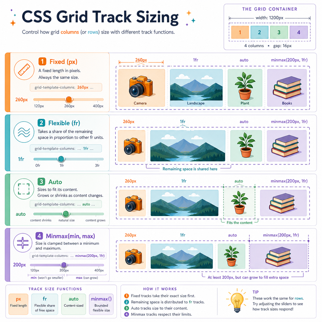
Common track sizing tools:
-
px: fixed size, useful for known rails or icons -
%: relative to the grid container -
fr: a share of leftover space -
auto: size based on content or available space, depending on context -
minmax(min, max): a bounded flexible track -
repeat(n, size): concise repeated tracks
A classic layout might say:
grid-template-columns: 240px minmax(0, 1fr) 320px;
Read that as: fixed navigation, flexible content, fixed aside.
The subtle expert move is minmax(0, 1fr). It prevents long content from forcing the flexible track wider than intended, which often matters for tables, code blocks, and long titles.
Gap Or Margin
True or false:
gap creates space between grid tracks without adding outer space around the grid container's edges.
Auto Placement
Let the browser place routine items
Not every grid item needs coordinates.
When you define columns and rows, unplaced children flow through the grid according to grid-auto-flow, which defaults to row-wise placement.
This is useful for galleries, search results, game inventories, and dashboards where most cards share the same placement rules.
Key distinction:
- Explicit placement: important regions like header, nav, main, footer
- Auto-placement: repeated items that can fill available cells naturally
Be careful with dense: it may visually backfill holes, but it can make visual order differ from source order. That matters for keyboard and screen reader expectations.
```js
const items = ["book", "sword", "potion", "map", "shield", "key"];
const columns = 3;

const placements = items.map((item, index) => {
  const row = Math.floor(index / columns) + 1;
  const column = (index % columns) + 1;
  return { item, row, column };
});

console.table(placements);
console.log("Auto-placement fills rows left-to-right when grid-auto-flow is row.");
```
Grid Debugging
Debug the contract, not the symptom
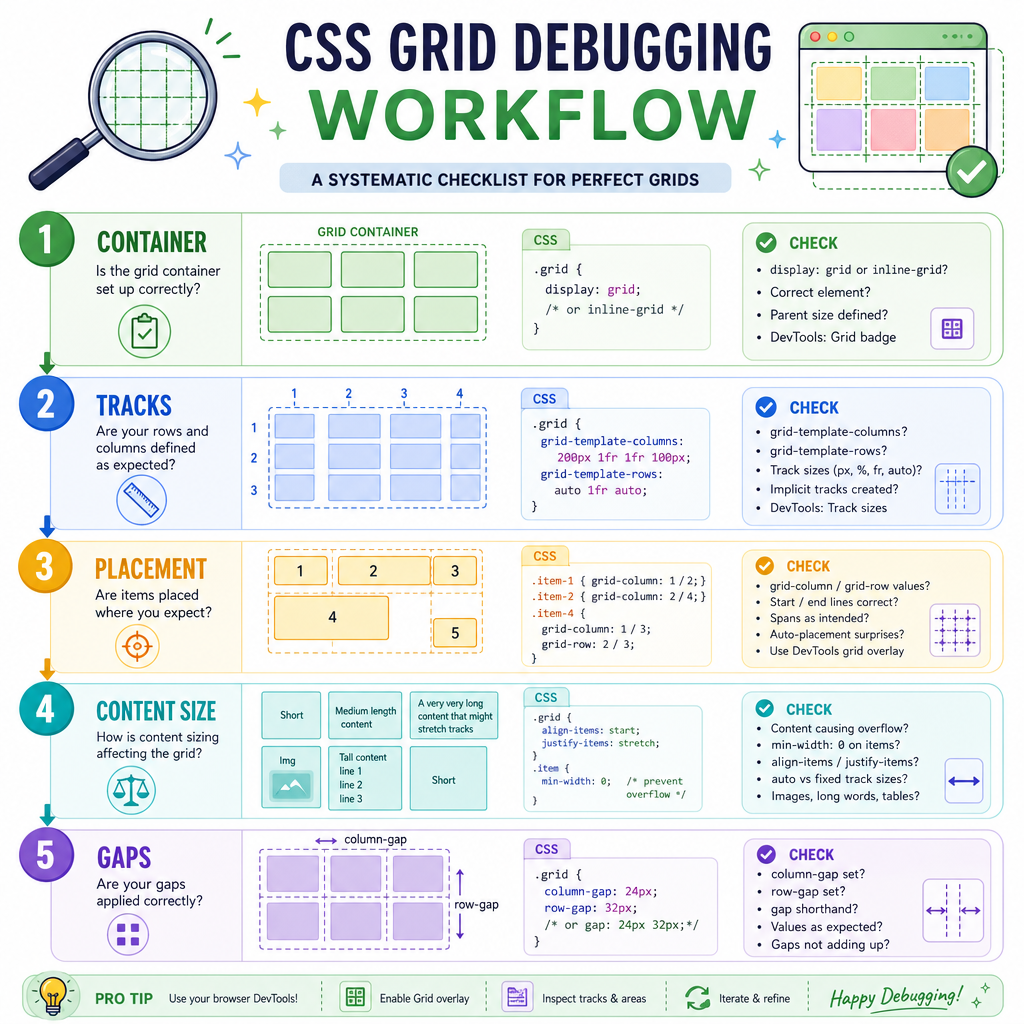
When a grid layout misbehaves, inspect it in this order:
- Is the right element the grid container? Only direct children become grid items.
- Are tracks defined where you think they are? Check columns, rows, and implicit tracks.
- Are items placed by line, area, or auto-flow? Avoid mixing strategies accidentally.
- Is content forcing track expansion? Long words, images, and tables can change sizing.
- Are gaps doing spacing work instead of child margins? Prefer container-owned gutters.
In interviews, do not frame Grid as "newer Flexbox." A stronger answer is:
Flexbox distributes items along one axis. Grid defines a two-dimensional coordinate system where the parent can own the layout plan.
That wording shows you understand both the API and the design tradeoff.