Responsive Web Design
Read at your own pace. Code execution, quizzes, progress tracking, and the AI tutor are available in the interactive view with JavaScript enabled.
Why Responsive Matters
From layout tools to layout judgment
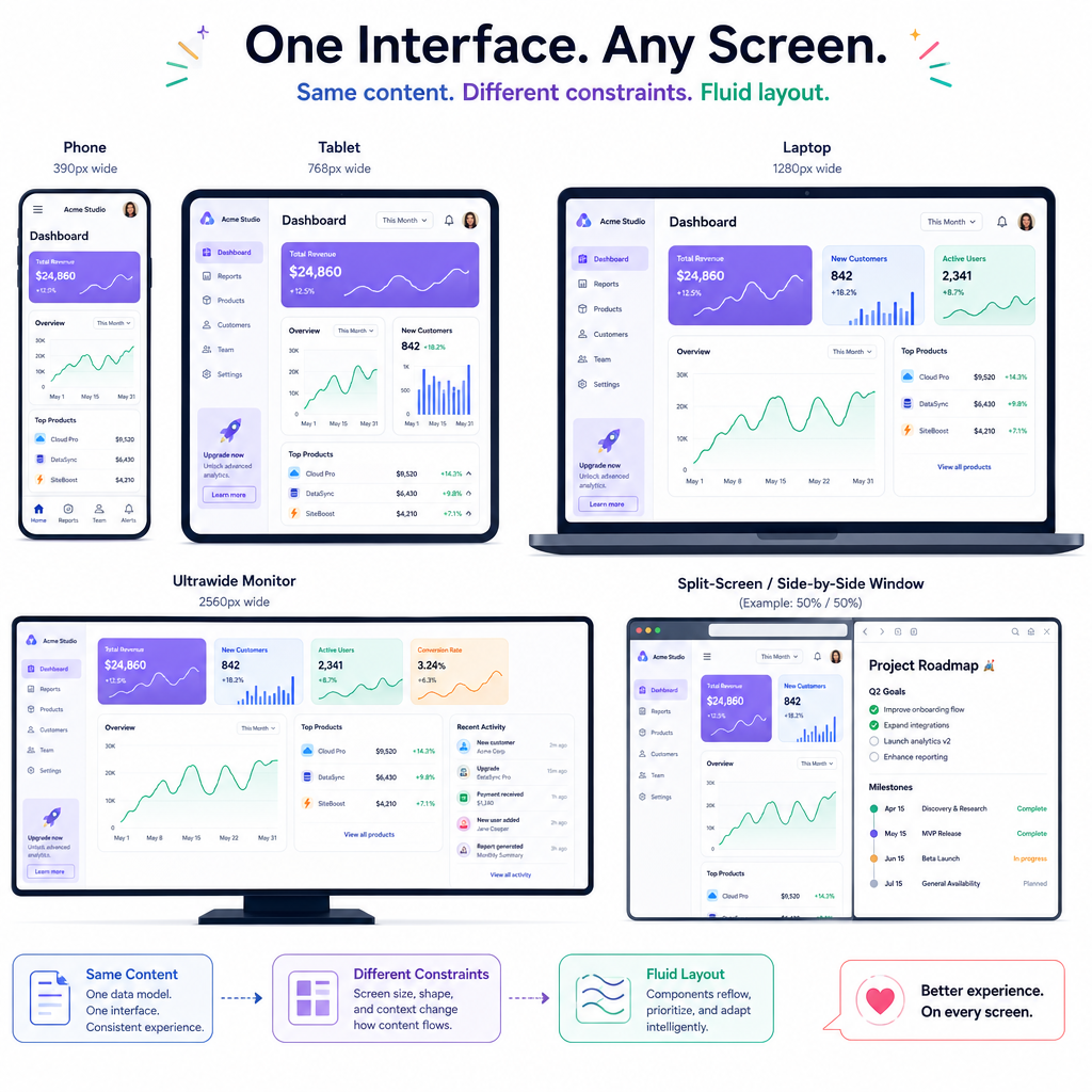
You just learned CSS Flexbox and CSS Grid, which gave you the mechanics for arranging UI. Responsive Web Design is the next layer: deciding how those arrangements should adapt when the user's context changes.
A staff-level frontend engineer is expected to think beyond “does it fit on my laptop?” You should be able to reason about:
- small phones, large monitors, split-screen windows, zoomed browsers
- touch and mouse input
- slow networks and high-density screens
- components reused in unpredictable containers
Think of it like adapting an action movie scene for IMAX, TV, and a phone: the story is the same, but the framing changes.
Responsive Mental Model
Responsive design is constraint negotiation
A responsive page is not “a desktop site plus a mobile site.” It is one experience that negotiates with available space.
Useful questions:
- What must remain readable? Text, labels, controls, data.
- What can reflow? Cards, nav items, sidebars, toolbars.
- What can collapse or defer? Secondary metadata, filters, supporting imagery.
- What should never depend only on width? Accessibility, semantics, and core actions.
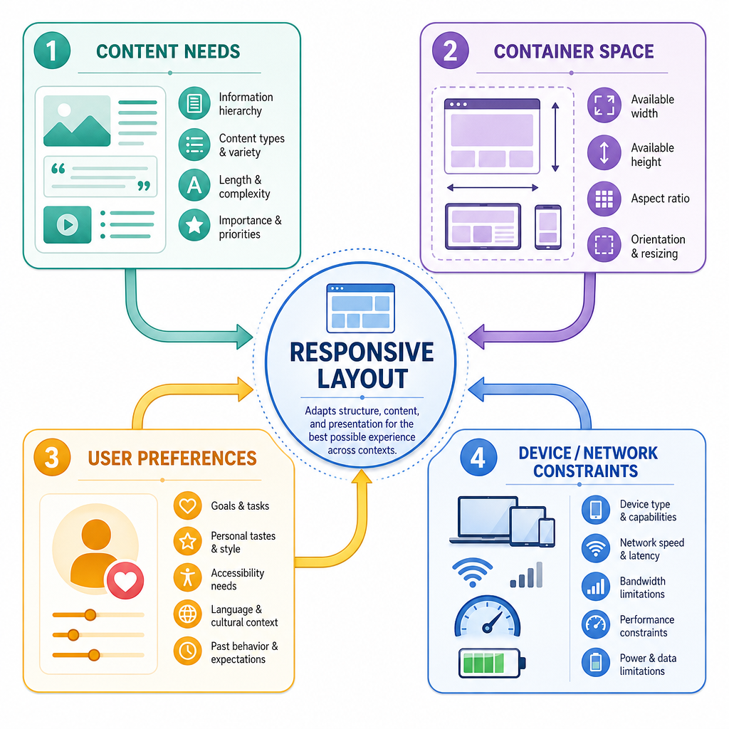
A practical model:
content needs
    +
container space
    +
user preferences
    +
device/network constraints
    =
responsive decision
The goal is not to chase every device. The goal is to create layouts that are resilient when the exact device is unknown.
Breakpoints Are Decisions
Don't start with device names
A breakpoint should represent a moment where the layout stops working well — not a brand of phone.
Weak breakpoint thinking:
- “iPhone width”
- “tablet width”
- “desktop width”
Stronger breakpoint thinking:
- “The card title wraps into four lines.”
- “The nav no longer fits beside the logo.”
- “The reading measure becomes too wide.”
- “The grid can support another column without cramping.”
In CSS, media queries are still useful, but the reason behind them matters more than the number.
```javascript
const widths = [320, 480, 640, 768, 1024, 1280];

function chooseArticleLayout(width) {
  if (width < 600) {
    return "single column: headline, image, body";
  }

  if (width < 960) {
    return "single column with wider reading measure";
  }

  return "two column: article plus related links";
}

for (const width of widths) {
  console.log(`${width}px -> ${chooseArticleLayout(width)}`);
}
```
Breakpoint Check
A product card looks good until the title, price, and CTA start colliding around 540px. What is the best reason to add a breakpoint near that width?
Fluid Before Fixed
Let CSS breathe before you intervene
Responsive design usually works best when you first make the default layout fluid, then add breakpoints only where needed.
Helpful tools:
-
%and fractional Grid tracks for flexible space -
min-width,max-width,min-height,max-heightfor guardrails -
remfor text and spacing that respects user settings -
clamp()for values that scale within safe bounds
A common pattern:
font-size: clamp(1rem, 2vw, 1.5rem);
Meaning:
- never below
1rem - prefer
2vwwhen it is within range - never above
1.5rem
That gives the interface a smooth difficulty curve instead of sudden boss fights at every breakpoint.
```javascript
function clamp(min, preferred, max) {
  return Math.min(Math.max(preferred, min), max);
}

const rootFontPx = 16;
const min = 1 * rootFontPx;
const max = 1.5 * rootFontPx;
const viewports = [320, 600, 900, 1400];

for (const viewport of viewports) {
  const preferred = viewport * 0.02; // similar to 2vw
  const result = clamp(min, preferred, max);
  console.log(`${viewport}px viewport -> ${result}px font size`);
}
```
Responsive Myth
True or false: A responsive design is complete once it has separate mobile, tablet, and desktop widths.
Component Containers
The page is not always the right source of truth
Media queries ask: “How wide is the viewport?”
But component systems often need a sharper question: “How much room does this component have?”
Imagine a recommendation card used in three places:
- a full-width homepage row
- a narrow sidebar
- a modal
The viewport may be huge, but the sidebar card is still cramped. That is where container-aware thinking matters.
Modern CSS supports container queries, for example:
@container (min-width: 30rem) { ... }
The staff-level habit is to design components that adapt to their actual surroundings, not just the browser window.

Responsive Media
Images and motion are part of responsiveness
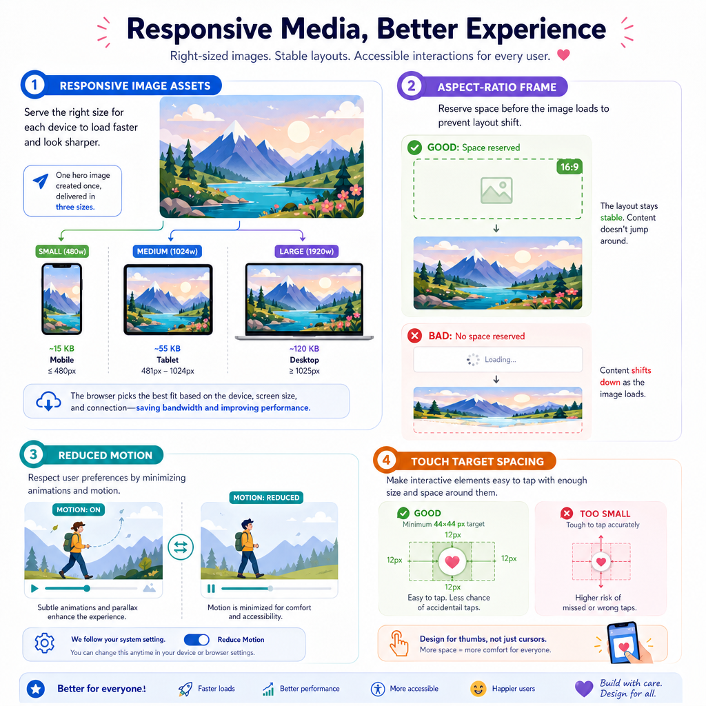
Responsive design is not only layout. Media can dominate performance and usability.
For images, consider:
-
Sizing: avoid layout shift with known dimensions or
aspect-ratio -
Source choice: serve appropriately sized assets with
srcset/sizes -
Cropping: use
object-fitwhen the image area changes shape - Density: high-DPI screens may need sharper assets
For motion and interaction, respect user context:
-
prefers-reduced-motionfor animation-sensitive users - larger tap targets for touch-heavy layouts
- enough spacing so controls do not become puzzle pieces
Your layout can be visually correct and still fail if it downloads a billboard-sized image into a tiny card.
CSS Function Recall
Fill in the blank: The CSS function commonly used to set a fluid value with a minimum, preferred value, and maximum is _____.
Responsive Verification
Test behavior, not screenshots
At this point in the course, you have enough CSS foundation to build responsive layouts deliberately. The next step is to verify them like an engineer.
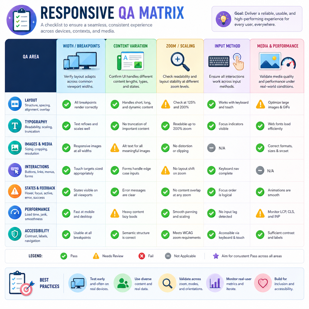
A useful review checklist:
- Resize slowly, not just at preset widths.
- Test real content: long names, missing images, extra labels.
- Zoom to 200% and check that core actions still work.
- Try keyboard navigation and touch-sized targets.
- Inspect Flexbox/Grid behavior using browser devtools.
- Check loading cost for responsive images.
This mindset sets you up well for the next lessons, where version control, the command line, and deployment will help you ship and iterate on this work safely.
```javascript
const widths = [320, 375, 768, 1024, 1440];
const contentCases = ["short title", "very very very long title", "missing image"];
const zoomLevels = [1, 2];

let testNumber = 1;

for (const width of widths) {
  for (const content of contentCases) {
    for (const zoom of zoomLevels) {
      console.log(
        `Test ${testNumber}: width=${width}px, zoom=${zoom * 100}%, content=${content}`
      );
      testNumber += 1;
    }
  }
}

console.log(`Total responsive checks: ${testNumber - 1}`);
```